Redesigning a Complex Authentication Flow
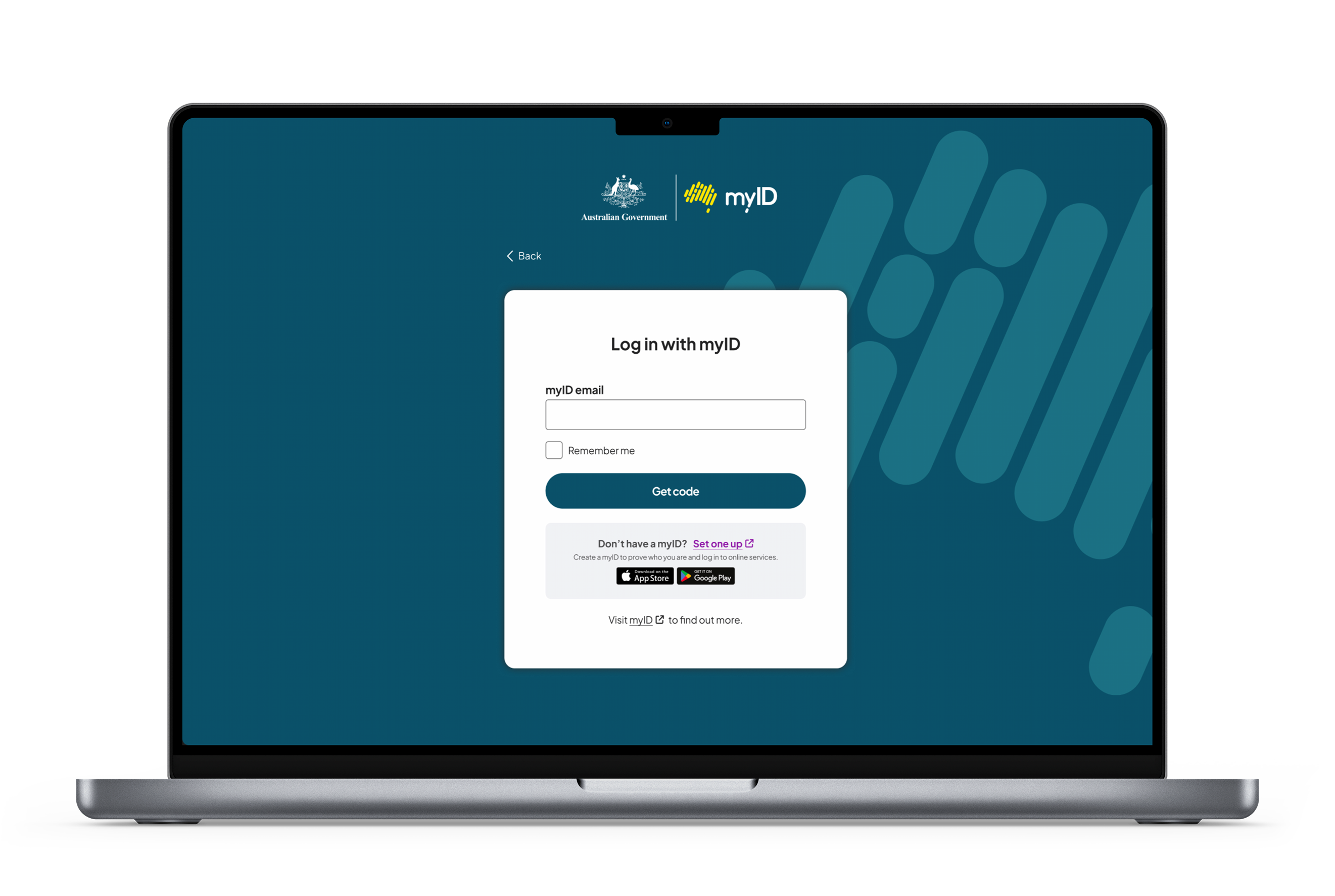
Old sign in page from myGovID (now myID)
The Challenge
The myGovID sign-in experience relied on a cross-device flow where users entered their email in the browser and then switched to a mobile app to input a code. While secure, this process wasn’t intuitive for many users.
The instructions were unclear, the relationship between the browser and mobile steps wasn’t obvious, and the overall experience didn’t align with familiar login patterns. As a result, users often felt unsure about what to do next — creating friction at a critical entry point to essential government services.
The goal
How might we make a multi-step, cross-device authentication flow feel simple and intuitive?

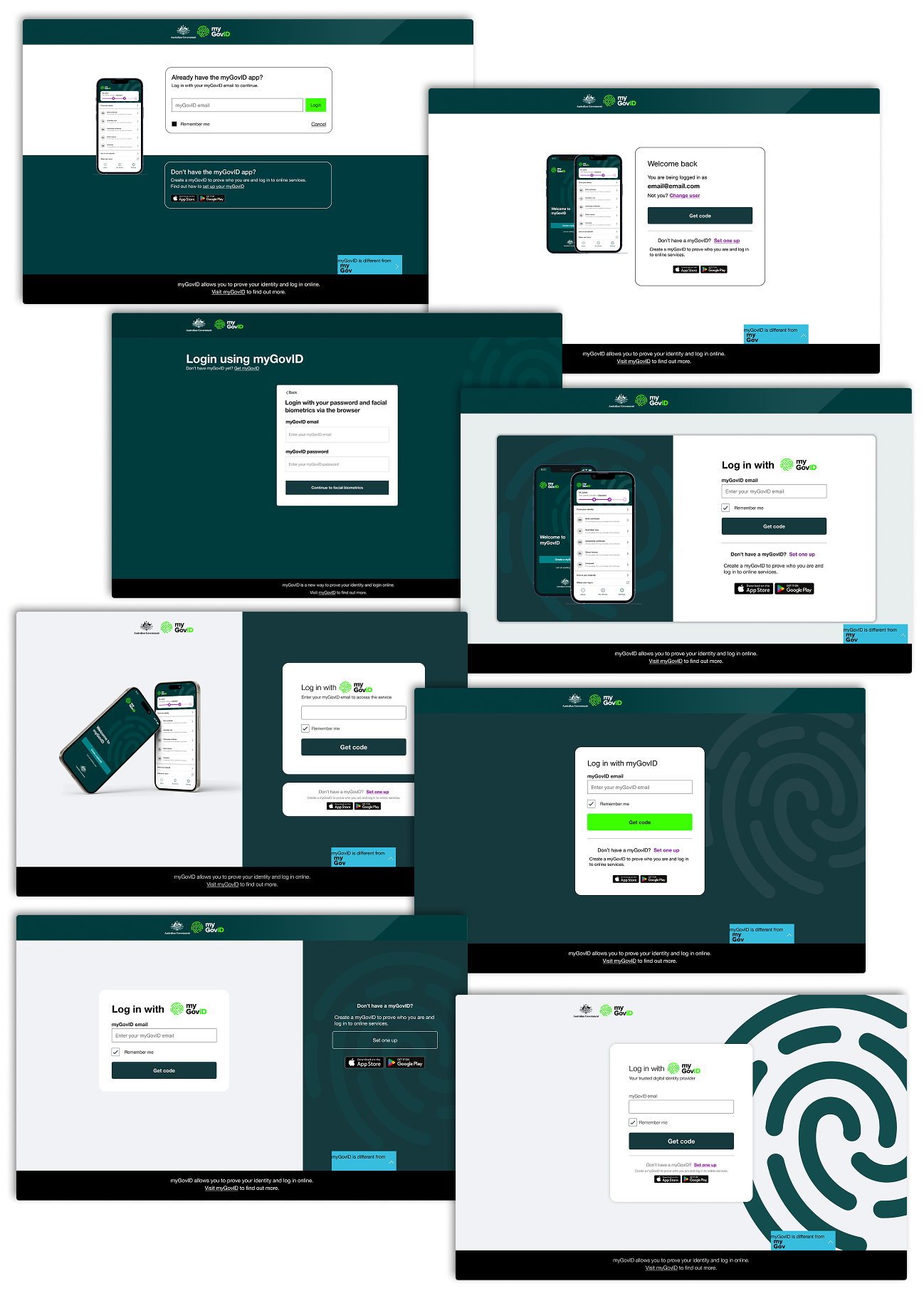
Current state analysis of UI.
My Approach
To better understand how users navigate multi-step authentication journeys, I reviewed sign-in experiences from products such as Uber, Wise and Shopify.

A common theme emerged: successful authentication flows minimise cognitive load by clearly communicating the next action and maintaining a strong sense of progress.
Using these insights, I explored several design directions focused on:
1
Simplifying instructions
2
Strengthening visual hierarchy
3
Making the cross-device interaction more explicit
4
Aligning the experience with familiar sign-in patterns
Multiple concepts were tested and refined through A/B testing and iterative design reviews with the team.
Key insight
The problem wasn't authentication itself.
Users generally understood the concept of signing in, but they often became uncertain when moving between devices. The biggest opportunity was reducing ambiguity and helping users feel confident about what to do next.
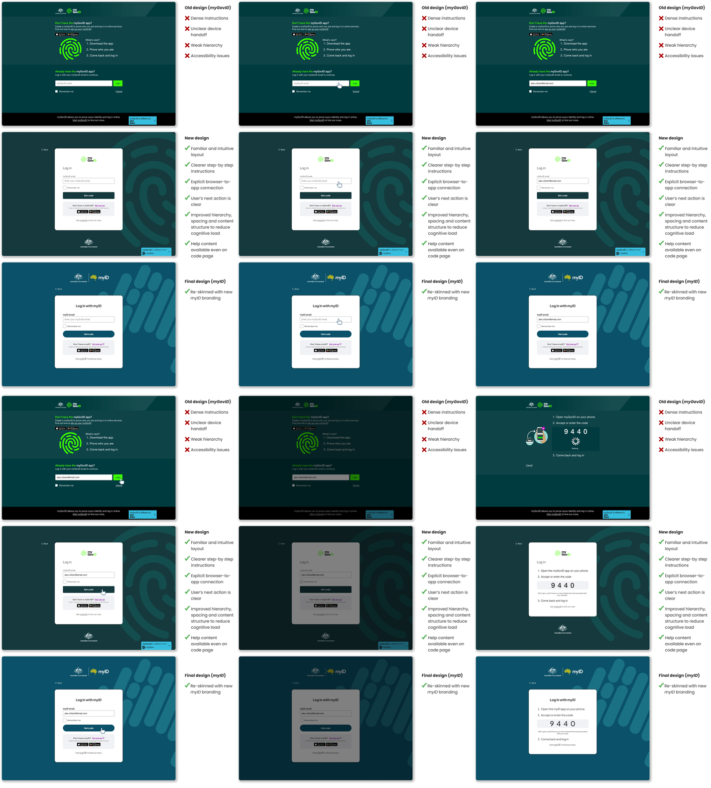
Final design: key screens
The final design focused on clarity, guidance and reassurance throughout the journey. Eventually, it had to be updated to align with the new myID branding.
Impact & Learnings
The redesigned authentication experience was well received by the business and users who were able to complete authentication with greater confidence. It made signing in easier to understand, particularly during the transition between browser and mobile.
I realised that one of the most important things with complex, authentication design is helping the user feel confident throughout the journey and reducing uncertainty.
You can have significant impact on user confidence with small improvements:
Clear guidance
is often more important than adding functionality
Strong visual and content cues
are required for cross-device experiences
Reducing cognitive load
can significantly improve user confidence
Balancing usability with security + policy constraints
can lead to great design